
Meredith / Cozi · Cross-platform product design
One family organizer.
A shared foundation.
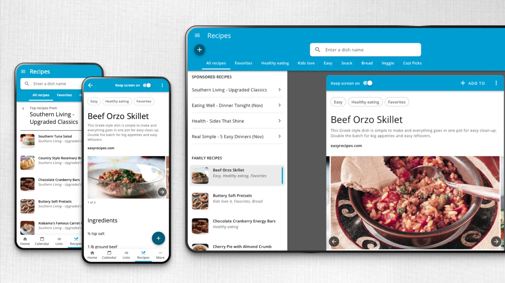
Unifying Cozi across devices, improving everyday workflows, and giving the team a more practical way to build what came next.
 View full size ↗
01 · The starting point
The same task felt different on every device.
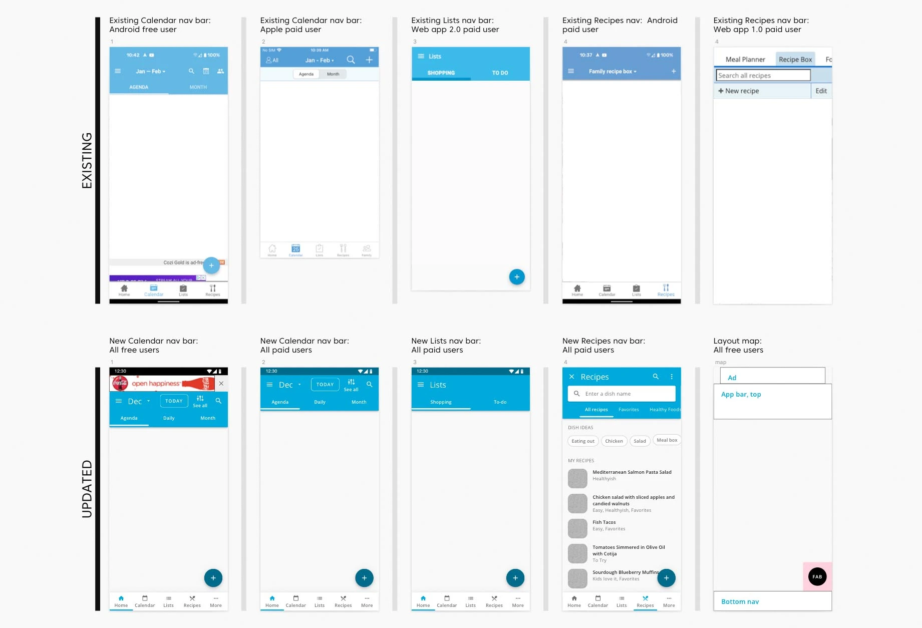
Cozi helps families coordinate calendars, meals, and lists. But its web, iOS, Android, and tablet experiences had grown apart. Familiar tasks had different layouts, controls, and behavior depending on where you opened the app.
I was brought in to assess the experience and help unify it under a tight relaunch timeline. The work needed to improve the product while respecting the existing components, data, and team’s capacity to implement changes.
 View full size ↗
02 · The foundation
Make the common decisions once.
I audited the application and consolidated its styling and components into a shared design system based on Material Design. We chose the Android system so we could reuse some of Cozi’s existing code and build quickly on a proven foundation for a consistent interface across native and web apps. Reusable Sketch symbols, an icon library, and wireframe components made it easier to explore new features without rebuilding familiar UI.
The guide covered more than appearance: component usage, states, motion, layouts, and variations across platforms and free and paid accounts. The goal was to make the next design decision easier for everyone who touched the product.
 View full size ↗
Shared components
Consolidated buttons, cards, icons, and recurring patterns.
Documented behavior
States, motion, and usage guidance alongside the visual design.
Flexible layouts
A common grid and patterns that could adapt across devices.
03 · Usability in the details
Keep the familiarity. Improve the fundamentals.
Cozi’s identity mattered, especially the colors families used to recognize one another. I explored palette options that improved contrast while staying close to the brand. Where contrast made colors too similar, I also proposed different hues.
I documented which text and icon treatments could be paired with each swatch, and streamlined button styles with explicit states on different backgrounds.
I walked stakeholders through accessibility requirements and the tradeoffs behind the options. That gave the team a concrete basis for choosing improvements they could prioritize immediately.
These decisions were carried into the component guide, turning individual fixes into guidance the team could reuse.
A useful system explains how to make the next decision.
04 · Putting the system to work
Connect the recipe to the plan.
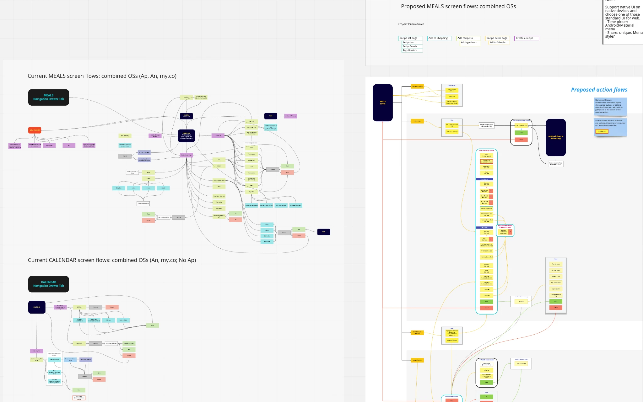
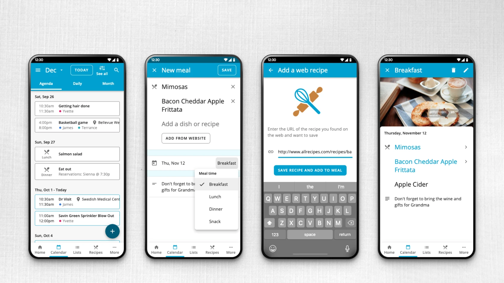
Recipes & Meals made the cross-platform problem tangible. A family needed to find a recipe, bring one in from the web, and add it to a meal without learning a different product on each device.
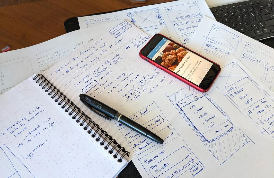
I worked through competitive analysis, existing and proposed flows, paper sketches, and digital wireframes. The scope included creating meals, importing recipes, and the details people needed while planning and cooking.
 View full size ↗
 View full size ↗
 View full size ↗
05 · Designing around real constraints
Consistency had to survive the content.
The presentation captured problems that a clean component library alone could not resolve: ad placement, responsive breakpoints, and inconsistent recipe data. Some recipes had missing imagery. Imported content used different labels for directions and instructions.
I explored image placeholders, content carousels, clearer content treatment, and a new ad location. These were product decisions as much as visual ones: the shared UI had to work with the material Cozi actually received.
Behavior belongs in the system, too.
The original prototypes show how details and settings respond as people interact with them. Documenting those transitions helped the team understand the intended experience beyond a static screen.
Original design prototypes · Press play to explore
06 · Making the work usable for the team
The handoff needed a shared process.
I served as Meredith’s design representative, working with Cozi’s product, engineering, marketing, and leadership teams. Progress depended on building trust with people who knew the product well and making the reasoning behind changes explicit.
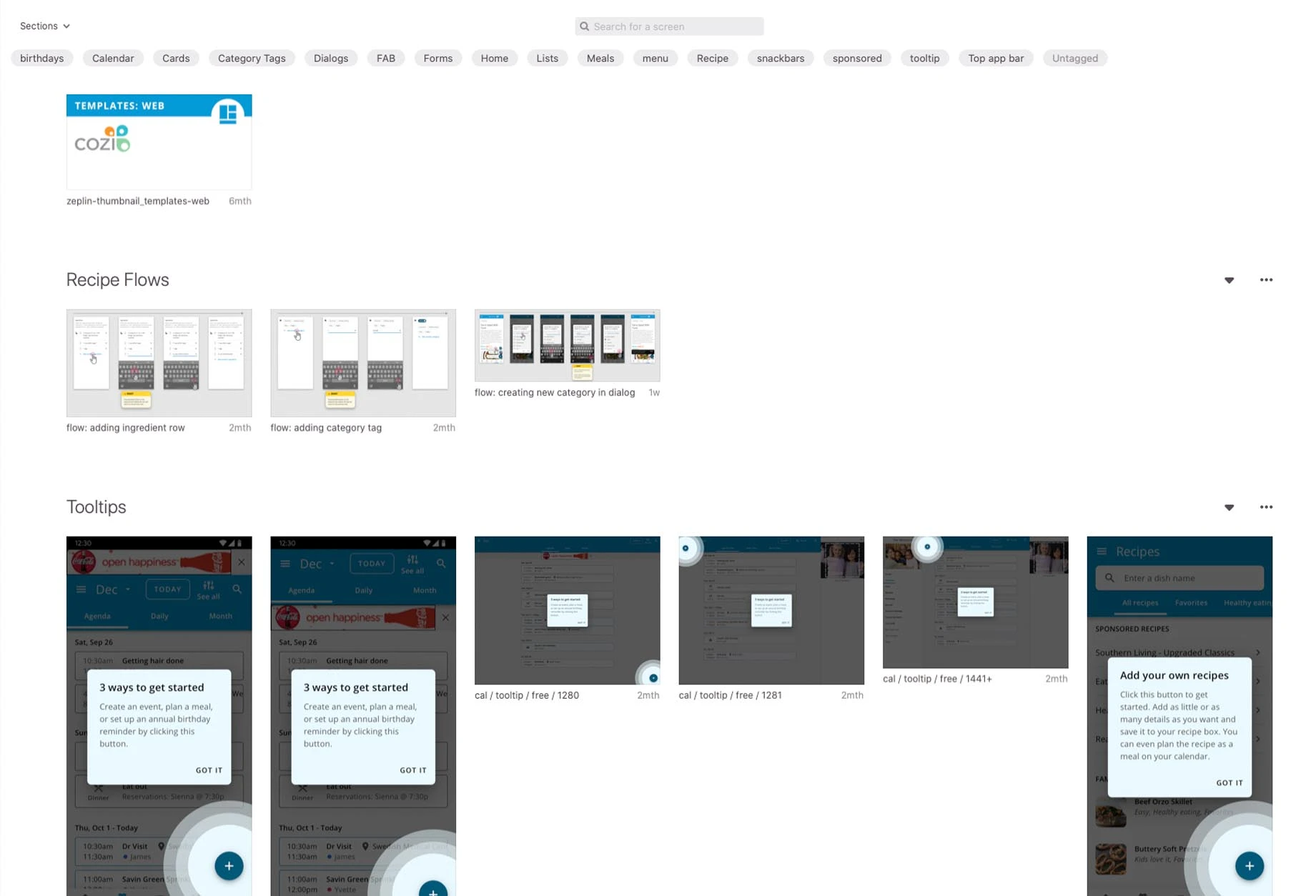
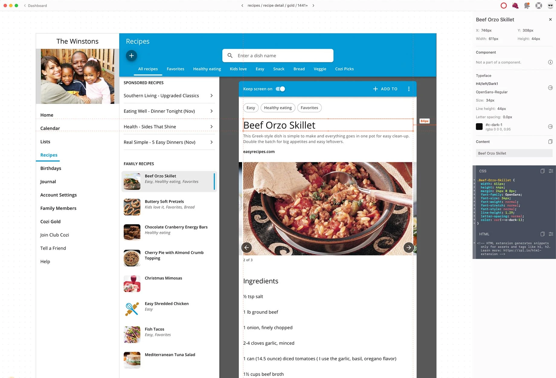
Weekly reviews kept stakeholders and developers involved. I introduced Zeplin for specifications and assets, helped product shape requirements that supported design and development, and coached the existing designer on the tools and system.
 View full size ↗
07 · Outcome & reflection
A clearer product. A more capable team.
The design system was actively used, substantial designs were built, and cross-platform consolidation was underway when I left. Components and views had been reduced, workflows streamlined, and the team had a shared reference for design and implementation.
Meredith’s ambition was for this foundation to inform future native applications. The outcome I can speak to is the Cozi work itself; the full redesign was still in development at my departure.
Product coherence
Shared patterns across platforms, with layouts adapted to each device.
Reusable decisions
Components, states, and usage guidance the team could carry into new features.
Better collaboration
Regular reviews and clearer specifications brought design and development closer together.
The lasting value was in the decisions and working habits the team could carry forward.